


At a glance.
The brief: a brand and a seasonal range of premium wooden greeting cards.
My call: let the wood lead. Pastel colour only on the edges, type engraved, one bold motif per card.
The result: 20+ designs taken from vector file to finished, laser-cut card.
21HOBNAILS LTD
INDUSTRY: greetings cards production
SCOPE: Brand and logo, product concept, greeting card range design, art direction
BRAND TONE: Cosy, soft, pastel, natural materials, celebration
ABOUT THE CLIENT
21HOBNAILS is our family business. It makes premium wooden greeting cards under the Ketroy Gift name and releases new designs every season, joining traditional woodwork with a modern look.
the assignment
What I was asked for: a brand, a logo and a seasonal range of wooden greeting cards.
What I understood: a wooden card is a premium product sitting next to paper cards that cost far less. It has to feel like a keepsake, something kept on a shelf after the birthday is over. It also has to be made by a laser in real wood, so a design that only works on screen isn't a design at all. And because new cards arrive every season, the brand had to be recognisable from one range to the next.
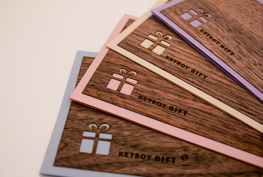
colour palette
China white
HEX #FAF3EB
RGB 250, 243, 235
CMYK 0/2/6/2
Azure blue
HEX #A4C2F4
RGB 164, 194, 244
CMYK 33/20/0/4
Walnut
HEX #462D20
RGB 70, 45, 32
CMYK 0/36/54/73
Candy pink
HEX #F4CDCD
RGB 244, 205, 205
CMYK 0/16/16/4
Lavender
HEX #B5A8D6
RGB 181, 168, 214
CMYK 16/22/0/16
Sand
HEX #F4DEBD
RGB 244, 222, 189
CMYK 0/9/22/4
textures

This palette is carefully crafted to complement wooden materials with a warm, unified aesthetic. China White and Sand provide inviting foundations that avoid the harshness of pure white, anchored by deep Walnut for legible typography.
The accent shades—Candy Pink, Azure, and Lavender—offer versatility across occasions. These specific pastels share matched high-brightness and low-saturation levels, ensuring they remain softly sophisticated rather than childish. This shared tonal value allows Lavender to naturally bridge the cool blue and warm pink, creating a beautifully cohesive collection.
inspiration: why this direction
Warm wood, soft daylight, a lived-in room with books and a blanket. The references are about a feeling rather than a style: the card as an object that belongs in a home. That's why the wood stays raw and visible, and why nothing about the range feels glossy or loud.

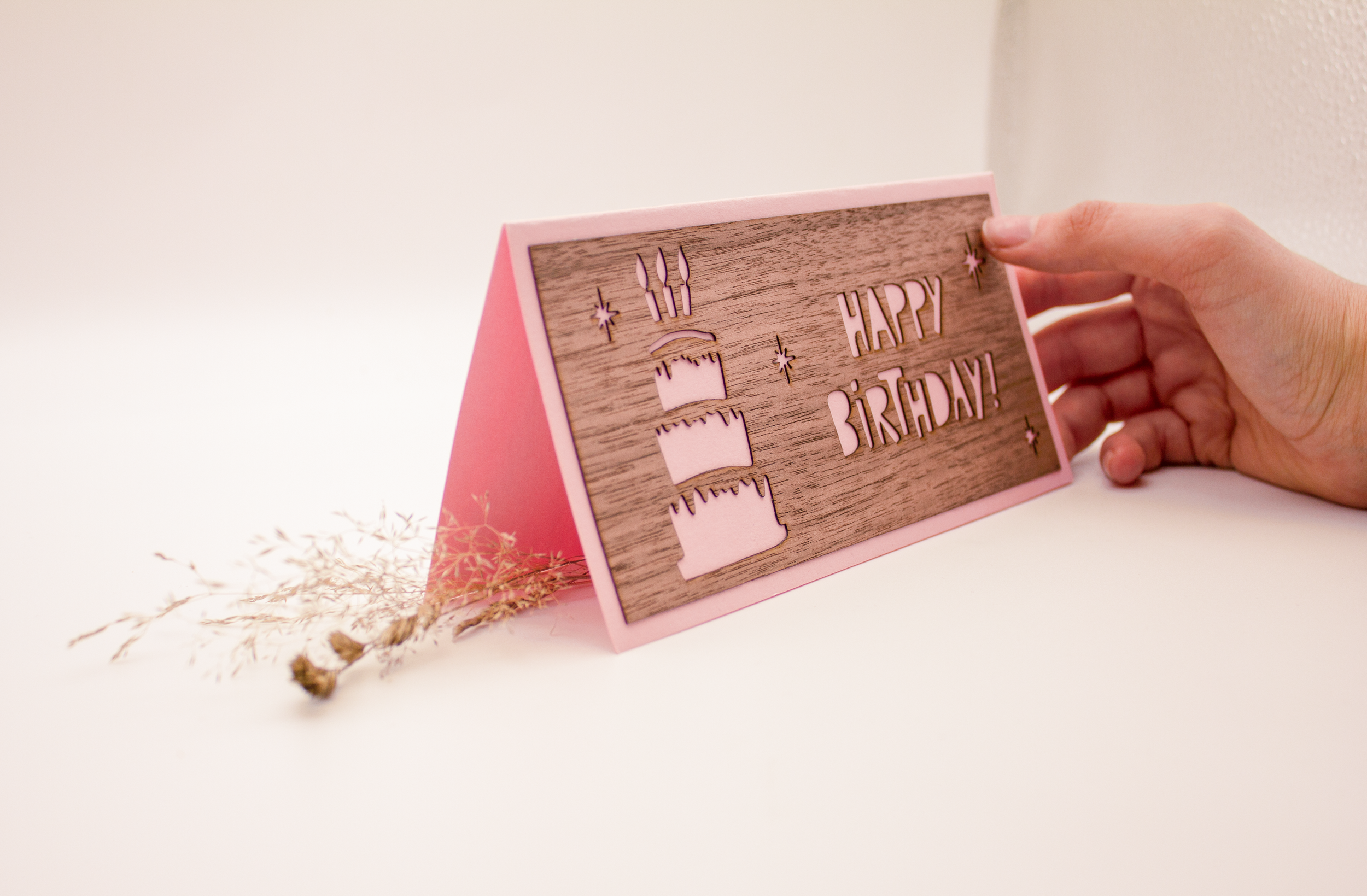


20+ designs, made to be cut
Over several seasons I designed more than 20 cards. Each one was sketched, drawn as a vector cut file, test-cut in wood and refined until the detail held. A design that looked beautiful on screen but broke in the wood was simplified, not forced. Alongside the fixed seasonal designs there are universal ones, made to say the things people most want to say.


A brand and logo used across every card, envelope and listing.
20+ designs taken from sketch to finished wooden card, each one tested in production before it was added to the range.
A soft, consistent family look, so a new season's card is recognisably Ketroy Gift.
Reworked product photography for the Amazon listings, showing the wood grain, the coloured edge and the card at real size in the hand.